Visualizing and Animating Michaud Optimization
The New Frontier logo is a stylized visualization of a Michaud Efficient Frontier. Composition maps, such as this one, chart the portfolio weights across the frontier, each asset portrayed with a different color on the map. The thickness of each color when the map is sliced vertically represents the portfolio weight of that asset for the efficient portfolio corresponding to that slice of the composition map. This type of chart is also known as a “100% stacked area chart,” and is perfectly suited for showing the internal composition of a range of portfolios, since the weights of the constituents must sum to 100%.
Composition maps illustrate the beauty and intuitive investment appeal of the Michaud efficient frontier. They consist of color coded blocks for each asset, stacked on top of each other to sum to 100%. Consider, for example, the dataset of eight global indices from Efficient Asset Management (Michaud 1998). The composition map of a standard Mean-Variance optimized efficient frontier is shown in Figure 1.
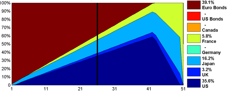

 Figure 1: Mean Variance Efficient Frontier for 8-Asset Case from Michaud (2008). The horizontal axis shows 51 portfolios, ranked by evenly spaced means (expected portfolio returns) across the range of possibilities. The vertical black line at portfolio 26 is the middle portfolio and its weights are shown in the legend.
This composition map shows a mean-variance optimized frontier ranging from minimum variance on the left to maximum return on the right. Some of the assets do not appear in any portfolios in the frontier. This makes no sense to knowledgeable investors since the eight assets were selected as worthwhile investments, and presumably all (or at least most) of them should appear in the invested portfolio. In spite of the historical performance of these indices, any of them could perform well going into the future, and it would make sense to have some exposure to every asset that has a chance of performing well in the future.
A composition map of the Michaud efficient frontier for this same universe, with the same mean and variance inputs, is shown in Figure 2.
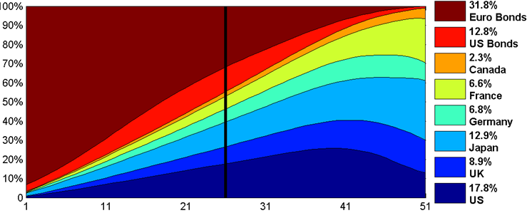

Figure 2: Michaud Frontier with the same inputs as Figure 1. The vertical rule here is also the middle portfolio as ranked by expected portfolio return.
The composition map of the Michaud Frontier in Figure 2 has every color-coded asset represented, showing much improved diversification over the mean-variance composition map. Additionally, transitions are smooth as risk increases, with no abrupt sharp changes in the portfolio composition. This composition map shows portfolios that make far more intuitive investment sense than those of the traditional Mean-Variance frontier. Moreover, the information of which assets are better has not been lost. The thicker stripes correspond generally with those of the traditional Mean-Variance frontier, showing a tendency to assign more weight to the assets that look better numerically according to the inputs.
The Michaud frontier is created by averaging together many mean-variance frontiers to achieve a smooth result. These individual frontiers each represent a possible alternative scenario, created from slightly altered inputs. This process serves as an acknowledgement that the inputs themselves are merely estimates and are not exactly correct.
The averaging process that creates the Michaud frontier can be animated to illustrate the birth of a Michaud frontier in real time. Three animations will be shown to illustrate the process which starts with the calculation of a single Markowitz frontier (Figure 1) and ends with the Michaud frontier (Figure 2). Each of these animations consists of three panels. The top panel shows each individual Mean-Variance frontier representing different market assumptions. The middle panel shows the cumulative average of thus far of the top panels, and the lower panel shows all the frontiers thus far plotted in a mean-variance chart: the standard deviation is the horizontal axis, and the expected return is the vertical axis. Again, the middle portfolios are shown by the thick vertical rule at portfolio 26, and the weights are shown in the legend on the right.
The first animation in Figure 3 moves slowly through the first ten simulations. The first frame shows identical maps for the top and middle panels, since only one portfolio has been averaged so far. Already by the tenth simulation, the Michaud frontier in the middle panel is smoother. However, Canada is still not represented much if at all in any frontier portfolios. The second animation, in Figure 4, moves more rapidly through the first 50 simulations. We can see substantial evolution in the Michaud Frontier toward the final answer, and Canada shows up at simulations 17, but the weights for the middle portfolio have not yet stabilized. The final animation, in Figure 5, moves even more rapidly through the first 200 simulation. We can see the portfolio weights stabilizing toward a final answer. However, many more simulations are usually run for investment cases. Often 5000 simulations are needed to assure that the Michaud portfolio weights have converged sufficiently to eliminate noise in the portfolio weights.
These animations show the calculation of the Michaud efficient frontier visually. The only way to calculate the Michaud frontier is though this compute-intensive process of performing many mean-variance optimizations on many alternative inputs, and combining them. The collected ensemble of different input assumptions creates a smooth consensus that compromises among all the sharp corners of the individual frontiers, and the result is not only a beautiful picture but a range of portfolios suitable for investing.


Figure 3: The first ten simulations at 1 frame per second.


Figure 4: The first 50 simulations at 2 frames per second.
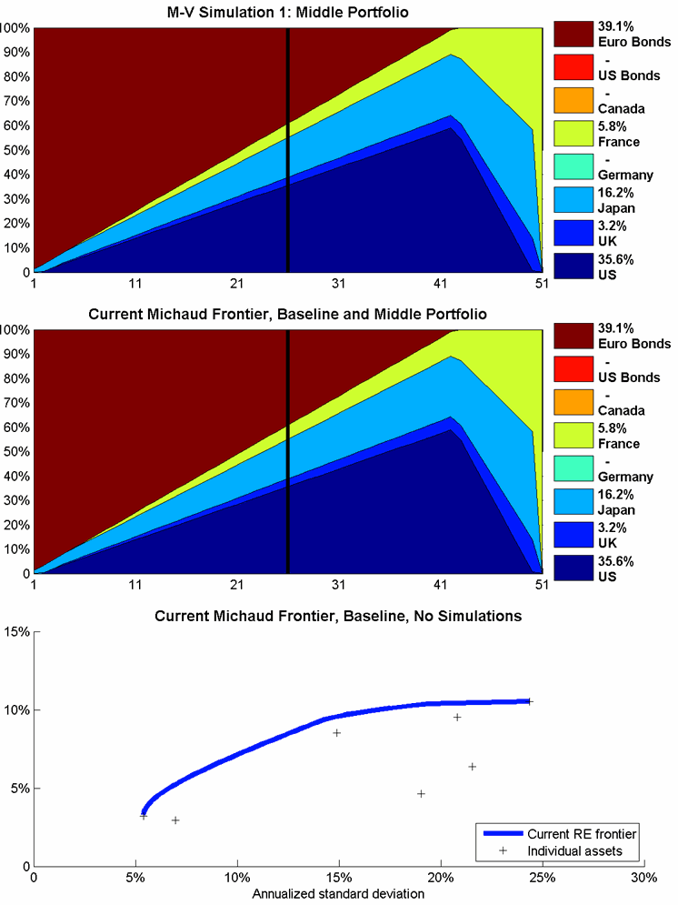

Figure 5: The first 200 simulations at 5 frames per second.
Sources
Michaud, R. (1998). Efficient Asset Management: A Practical Guide to Stock Portfolio Optimization and Asset Allocation. Boston, MA: Harvard Business School Press.
comments powered by Disqus
Locate Us
New Frontier Advisors
155 Federal Street
Boston, MA 02110
617.482.1433
Contact us to find out how you can invest in New Frontier portfolios.